Non-profit homepage redesign
June 2022
For the final capstone project of the first semester of Netflix's UX/UI bootcamp, we were placed into randomized groups to simulate a real design team. We were tasked with redesigning the website of a local non-profit organization within a 4 week time frame, and we chose The Little Red Dog which is a dog rescue and adoption center in Orange County, California.
From an initial glance at the original website, we thought the homepage was not cohesive and it was unclear of what their mission was and how to take action. You can view screenshots of the original homepage at the time in the first image below.
We began our research by trying to gain a deeper understanding of our users through creating a proto-persona. We based our proto-persona off our team's collective previous knowledge and experience with animal non-profits and those who interact with them.
We then conducted a competitor analysis by analyzing two other similar animal non-profit organizations in Orange County. We found that although the other websites had more modern designs and visuals, their goals, pain points, and weaknesses were quite similar.
Our team also collaboratively conducted a heuristic evaluation of The Little Red Dog's current website. Through this, we decided there were elements of the current website that we wanted to keep in the redesign such as color scheme and icon set. We also discovered there were a lot of ambiguity in the navigation and information architecture, and there were some features that were almost hidden such as the cat adoption page that only could be viewed when users clicked on dogs they could adopt.
The next step of our design process was to create a user research plan and speak to real users who either had experience with non-profits or animal rescues. We conducted four user interviews and received 6 survey responses. We then sorted our results into an affinity diagram and discovered trends among our users. Most users wanted as much information as possible about non-profit organizations as accessibility and easily as possible due to the sensitive nature of donations and animal adoption. Many users placed an emphasis on being able to find information that affirmed the organization aligned with their personal values before wanting to interact with it.
We synthesized our data and came up with a user insight statement.
"During our user interviews, we discovered that people want to involve themselves with credible non-profit organizations that share similar values.
Therefore, we believe that people want to be able to easily get information about non-profit organizations before making a decision to donate and that we might be able to help if we redesign the website’s navigation bar and create a more identifiable donation flow.
We might do this by changing the navigational hierarchy and making navigation options clearly visible. Doing this will allow our product to quickly inform more users about The Little Red Dog’s mission and increase the amount of donations received."
From there, we began our defining phase by creating a problem statement and a solution.
Problem:
Users are not able to access needed information about donating, adopting, or fostering from the non-profit dog rescue lowering overall website user engagement.
Solution:
Improve the website’s navigation system, so users can easily find wanted information and will in turn increase animal rescues.
With these two statements, my team drafted a value proposition for our redesign. We also revisited our proto-persona to create a user persona based on real data so that we can truly empathize with and understand our users. Our persona is Joe who likes giving back to his community, but is scared of donating to or supporting an organization that is a scam or doesn’t share his values and beliefs. Thus, his primary goal is to be as informed as possible before making the decision to donate money or adopt a pet from a non-profit organization.
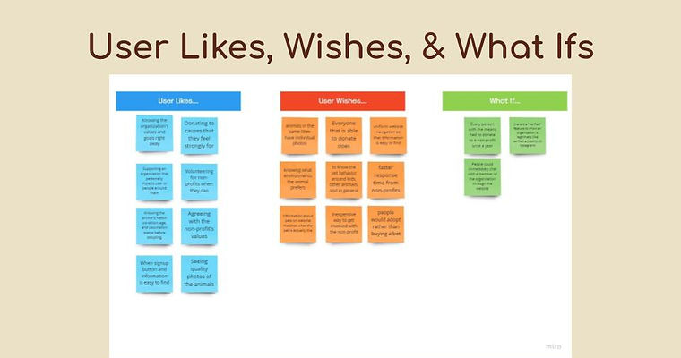
We sorted our data from interviews into a User Likes, Wishes, and What Ifs chart to brainstorm what we should keep on the site and what are some key things we can add or provide to users. A key point that coexisted in all categories is that generally, most people want to get involved with an organization that shares similar values as them and provides a lot of information to show they are trustworthy and credible. Users also really wanted desired information to be easy to find right away.
We also created a scenario to define how a user would donate on the website directly from the homepage and further understand goals, motivations, and pain points. From there, I adapted the the scenario into a storyboard which helped us visualize how a user will interact with our redesigned product.
Our team began to sketch visual representations of our redesigned homepage that we brainstormed based on our research findings. We combined the best elements from each prototype that we thought would most effectively create an improved webpage.
Before we created a prototype, we wanted to revisit the information architecture. We conducted card sorting among our team to create our menu structure and navigation paths. We were able to come up with eight different categories for our navigation bar which includes adoption forms and "About Us" sections. From the card sorting, we were able to further flesh out our navigation system by creating a site map. Our sitemap mainly focuses on the structure of our navigation bar and the footer.
With our site map completed, we created a user flow diagram to visualize the process of a user learning about the organization and then going through the donation process. We chose to focus mostly on the donation process as most of our interviewees were more interested in making donations than animal adoption.
We then created wireframes that we turned into low-fidelity prototypes. We chose to make a mobile version redesign as well to create a more mobile-friendly design and incorporate dynamic elements while keeping the same content and visual familiarity as the desktop site.
We updated these low-fidelity prototypes into mid-fidelity versions by adding images, fonts, exact copy, and updating the header and footer to make them visually pleasing and easy to navigate. Some interactions were still limited in this version.
With our mid-fidelity prototypes, we conducted usability tests with both the mobile and desktop versions. Some of our key discoveries were that some pages felt overwhelming due to the amount of information and smaller text size and that some buttons on our mobile prototype were too small for users to press with their fingers.
Prior to creating a high-fidelity type, we wanted to ensure the site maintained a consistent style. This led us to compiling style inspiration and creating a style guide and style tile.
With our style guide and mid-fidelity prototype usability test results in mind, our group created high-fidelity prototypes. We were able to further improve our navigation system by adding more button states: for example, when you hover over a button they will change colors, while if you hover over other categories in the nav-bar they will highlight red.
During our mid-fidelity user testing, we also found that a lot of users tend to go to the footer for navigation so we implemented that into our high-fidelity prototypes. Some changes we made to the high-fidelity mobile prototype was in the hamburger menu. Initially it looked more like a long list ,but during our testing users didn’t really like the layout as it was a little long and could be overwhelming. So for our high-fidelity mobile prototype we changed it to have drop down menus to condense it.
We then ran another round of usability tests with our updated high-fidelity prototypes. We discovered that while most of our users found our flow and navigation quite easy and were able to complete the tasks on our own, they would appreciate some small changes like adding an About Us link to the footer and changing the size of the donate button. We also conducted AB testing on our monthly donation page and and discovered that generally people prefer to see all the information at once rather than having to click through in order to help them learn more about the organization and build trust.
If given a longer time frame to continue the project, I would like to conduct more usability tests in order to mitigate bias and come to a more clear consensus about particular features such as the hamburger menu. I would also like to present the prototypes to the founders of The Little Red Dog to hear their opinions and feedback.